
Cybersecurity with swagger
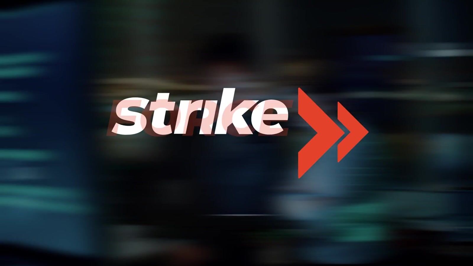
A high-contrast identity system paired with looping motion headers that feel like a strike, not a status update.
See what changedWhat had to change.
5ironCyber needed a brand presence that reads instantly as credible, modern, and assertive—without blending into the usual "matrix green + hacker hoodie" cybersecurity visuals. They also needed sales materials that could explain value fast: on a call, in a deck, or in someone's inbox.
What we built.
Each piece had a job. Together, they moved the same decision forward.
Brand Strategy & Positioning
Built positioning around active response, plus a one-page brand guide sales could actually use.
Identity & Design
Designed the logo, color and type system, data sheets, and looping motion headers.
Brand Core + Positioning
Identity Built Around Active Response
The visual system was designed around 5ironCyber's actual positioning: active response, not passive monitoring. The look leans tactical and kinetic—bold typography, sharp contrast, and motion energy that supports the message "we don't just detect, we move."
What this included
- Primary lockup with integrated tagline
- 5i bug mark for compact applications
- Brand strategy one-pager for sales enablement
- Color system: Sentinel Grey (#505050) + Alert Orange (#F04F24)
Sales Enablement + Collateral
5iDR Data Sheets + Key Benefits
Michael built the 5iDR data sheet around the questions a buyer scans for first: response coverage, visibility, data limits, and malware detection. Reusable blocks let the team make the next one-sheet without rebuilding the layout.
What this included
- Data sheet layout optimized for quick scanning
- Key benefits structure for rapid value communication
- Modular blocks for future capability pages
- Premium feel that matches the brand positioning
Motion Header System
Looping Visuals for Web + Social
Motion direction built around impact + containment: shield iconography, energy bursts, alert pulses, and orbiting ring cues that match the 5i mark language. Designed to loop cleanly for web headers, social banners, and product reveals.
What this included
- Impact-focused motion language
- Shield and containment visual metaphors
- Clean loops for web and social applications
- Alert pulse animations that reinforce brand energy
What changed.
Visual identity built around actual positioning (active response, not passive monitoring) creates immediate credibility in a crowded category.
See the full result record
- A brand that's recognizable from across the room (or across LinkedIn)
- Sales materials that feel premium instead of "template"
- Internal team finally comfortable putting the brand behind their names
- Motion headers loop cleanly for web, social banners, and product reveals
The people behind the work.
- Michael Sebastian
- Brand Strategy, Visual Design, Motion Direction · Layout Design, Copywriting, System Architecture · Motion Concept, Direction, Design